GOCC Brand & Identity Guidelines
Consistent. Recognizable. Student-Centered.
The Glen Oaks Community College brand reflects who we are and how we serve our community. Every logo, color, and visual element supports our mission to provide opportunities for academic and lifelong success through excellence in teaching and comprehensive support services .
This guide ensures that all internal and external communications represent Glen Oaks clearly, professionally, and consistently.
Whether you are designing a brochure, updating a webpage, producing signage, or creating promotional materials, these standards help protect and strengthen the GOCC brand.
Why Brand Consistency Matters
Consistent visual identity:
- Builds trust with students, families, and community partners
- Reinforces institutional credibility
- Strengthens regional recognition in southern Michigan and northern Indiana
- Aligns marketing efforts with GOCC’s Strategic Plan priorities for community awareness and engagement
Every logo placement, color choice, and design decision reflects our commitment to excellence, integrity, and student-centered service.
Official Logos & Identifying Elements
Each visual element serves a specific purpose. Use them intentionally and according to the guidelines below.
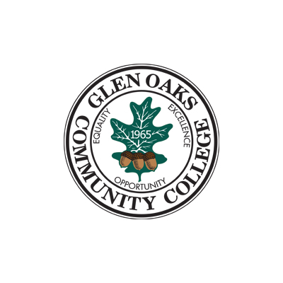
Official Seal
The official College seal is the most formal representation of Glen Oaks Community
College. It reflects the institution’s mission, vision, and long-standing commitment
to student success.
When to use the Seal
- Diplomas and certificates
- Official letterhead
- Formal institutional documents
- Commencement materials
- Board of Trustees communications
The seal should typically appear alongside the official nameplate.
Do not alter, stretch, recolor, or modify the seal in any way.
Approved Versions:
Black | Green | White | Full Color
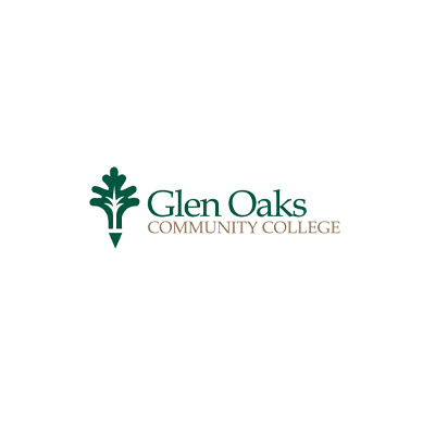
Nameplate
The nameplate clearly spells out Glen Oaks Community College and is used across formal
and promotional materials.
When to Use the Nameplate
- With the seal on formal documents
- With the oak leaf on marketing materials
- On webpages, advertisements, and print materials
Approved Versions:
Black | White | Green | Yellow | Green & Yellow | Green & Gold
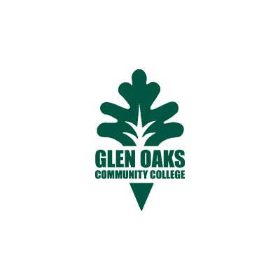
Oak Leaf
The oak leaf represents strength, growth, and rooted community. It should always be used in conjunction with the nameplate for promotional and marketing materials.
This mark is ideal for:
- Recruitment campaigns
- Program brochures
- Social media graphics
- Campus signage
Approved Versions:
Black | Green | White
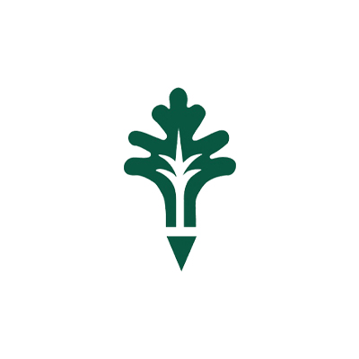
Text Oak Leaf
The Text Oak Leaf is the vertical rendition of the GOCC leaf logo. It offers greater flexibility for narrow or vertical layouts.
Use this version when:
- Designing banners or vertical signage
- Creating digital sidebar graphics
- Producing apparel or specialty merchandise
Approved Versions:
Black | Green | White | Yellow
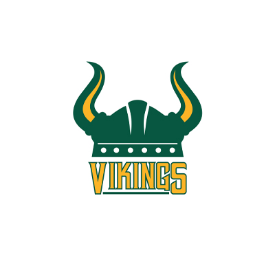
Viking Helmet
The Viking Helmet represents GOCC Athletics and school spirit
When to use the Viking helmet
- Team uniforms
- Gamed day graphics
- Student life
- School spirit
This logo should not replace the institutional nameplate or seal in academic or administrative materials.
Approved Versions:
Official Brand Colors
The Glen Oaks Community College color palette reinforces our institutional identity and ensures visual consistency across all communications. Our primary brand colors form the foundation of the GOCC identity and should be used prominently in marketing, digital, and print materials. Accent colors provide visual flexibility while supporting, not competing with, the primary green and gold palette.
Primary Brand Colors
Pantone 7484C
HEX = #00573F
RGB = 0, 87, 63
Pantone 1235C
HEX = #FFB81C
RGB = 255, 184, 28
Pantone 874C
HEX = #8C6F4B
RGB = 140, 111, 75
Pantone 139C
HEX = #AF6D04
RGB = 175, 109, 4
Accent Colors
Pantone 729C
HEX = #B58150
RGB = 181, 129, 80
Pantone 534C
HEX = #1B365D
RGB = 27, 54, 93
Pantone 423C
HEX = #898D8D
RGB = 137, 141, 141
Pantone 201C
HEX = #9D2235
RGB = 157, 34, 53
Pantone 2746C
HEX = #171C8F
RGB = 23, 28, 143
Accent colors add visual interest but should never overpower the primary green and gold palette.
Brand Alignment & Strategic Impact
The Glen Oaks brand is more than a logo. It reflects:
- Student-centered values
- Commitment to workforce development
- Community partnership and engagement
- Excellence and innovation in teaching
Every design decision supports our strategic pillars, including enrollment growth, workforce development, student success, and community awareness .